RESEARCH - ARTEFACT 1 - GREEN SCREEN KEYING
( Excuse the watermarks on some of the images - Student version of NUKE)

Okay, so my 1st Artefact was to look at keying within NUKE. To do this I had to start with learning the basics of the software and then the fundamentals of keying a green screen image. Further to this, I did some reading on "How to light a green screen", as it was going to be a big part of the project. Thanks to the videos and reading at digitaltutors.com for this!!!

So to make a start with the Artefact I began by travelling to Dovedale
over the weekend to get some nice backgrounds for the comps! I got some
great shots, but one of the first issues I faced when comping was the
incongruent foregrounds. My two models were not dressed correctly and
even once they had been colour corrected looked 'out of place'. - I used a few of them, but to get round this and for the sake of the artefact, I found some better backgrounds online.
If I am to continue with keying, next
time I will know to make sure the two stills are congruent! - In this
case the attire of the model must compliment the backgrounds.
As mentioned, once they initial
keying had been done, I played around with the position, grade and
colours of the images. The aim here was to "combine two or more images
to create a single seamless whole".
Some of the problems I faced:

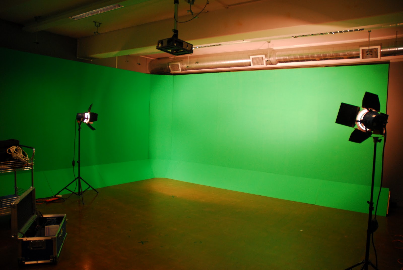
I hired out a D200 Nikon Camera, the Motion Capture Suite and two Lighting Kits. As you can see from the images, the lighting was one of the biggest problems. I began by attempting to get a clean single coloured lighting setup across the green screen. I played around with lights, angles and filters to eventually get the environment I was after. In addition to this, I had a third light at the back of the room to separately illuminate the subject.


